Marketing, Style, Technology
The Latest Website Designs: Innovations for Online Business Success
As we step through 2023, we’re seeing the impactful role that web design plays in the triumph of businesses engaging with the vast digital landscape. Here in Australia, our commitment to keeping our online presence robust is tied to integrating cutting-edge web design trends that elevate our digital interfaces far above the ordinary. This isn’t just about a splash of interactivity; it’s about creating experiences that resonate with our values and our audience’s expectations.
Our focus is to distinguish our online spaces in cyberspace, securing online business success through innovative design principles that reflect our brand’s ethos. We’re not just after a stylish facade; we’re architecting experiences with thoughtful design choices—experimental navigation, kinetic typography, and engaging scrolling effects—that drive palpable brand engagement.
Cyberspace differentiation is at the forefront of our strategy, with visual branding receiving the dedicated attention it needs to thrive. By continuously evolving and adapting to the latest design benchmarks, we ensure that our virtual front remains engaging and relevant. Thus, we not only captivate but also retain an audience that’s integral to the sustained growth of businesses in the digital domain.
Key Takeaways
- Continually adopt the latest web design trends to establish a competitive edge in cyberspace.
- Ensure the design choices reflect and strengthen your online business success.
- Use innovative navigation and kinetic typography to enhance user engagement and brand storytelling.
- Incorporate scrolling effects for a dynamic user experience that captures attention.
- Strategically use visual branding to make a resounding impact in the digital marketplace.
Experimental Navigation: Pushing Creative Boundaries
In 2023, we’re charting a new course in web design by adopting **innovative navigation patterns** that not only enhance **user engagement** but also amplify **brand uniqueness**. Diverging from the conventional top-of-the-screen menu layout, we’re steering towards navigation that not only serves its foundational purpose but also becomes a core aspect of our brand’s visual identity.
Consider the transformative design approach taken by acclaimed designers like Kim Kneipp. Their websites have boldly reimagined how users move through digital spaces, encouraging a narrative-style journey with content mapped out in a thoughtfully preordained sequence. Through an intricate dance of numbers, types, and colours, these navigational strategies beckon users to immerse themselves fully in the experience, contributing to a deeper connection with the brand
Our web navigation elements are the characters of our story, each leading to the next chapter of user interaction and brand discovery.
Breaking away from the conventional menu is not merely a cosmetic change; it’s a strategic manoeuvre to claim our unique spot in the digital landscape and tell our tale in the most engaging way possible.
When it comes to experimental navigation, consider the tangible impact it can have:
| Traditional Navigation | Experimental Navigation |
|---|---|
| Linear user journey | Non-linear, story-like user journey |
| Uniform website experience | Customised user interface reflecting brand personality |
| Functional but forgettable | Memorable and interactive |
As proponents of this dynamic web design realm, we advocate for navigation that does justice to both form and function—compelling users to stay, explore, and engage with our digital offerings. It’s through such pioneering efforts that we carve out a niche for ourselves and tell the world, “We’re not just another brand; we’re an experience.”
- We create sensory touchpoints through visuals and interactions that resonate with users on a personal level.
- We harness the power of color psychology and typographic hierarchy to guide user behavior.
- We utilise layout and motion to foster visual harmony and narrative flow.
Looking forward, as we embrace these experimental navigation avenues, we unlock new possibilities for fostering deep connections with our clientele. The digital ecosystem is ripe for innovation, and we are at the helm, navigating towards a future where each click and scroll tells a part of our unique story.
Kinetic Typography: Bringing Words to Life
In the pulsating heart of the digital world, we find ourselves embracing a renaissance of sorts—a revival that transforms static pages into dynamic canvases where animated text captures the imagination from the get-go. This revival is none other than kinetic typography, a trend that can trace its ancestry back to the animated opening sequences of cinema’s golden age. Now, it’s our turn to harness this dynamic web content strategy to amplify visual engagement on Australian online platforms.
Take the example of Arcadia’s digital space, where moving text becomes a guide through the narrative of their domain, unveiling content in an almost theatrical manner. This isn’t just about the aesthetics—it’s a deliberate tool in our arsenal, elevating content strategy to an art form that intertwines seamlessly with our storytelling capabilities.

Our deployment of kinetic typography extends far beyond mere decoration. It wields the power to direct our audience’s attention, punctuate important messages, and facilitate a user journey that is both informative and visually compelling. It’s not just words on a screen—it’s an orchestrated dance of letters and phrases that beckon users deeper into the experience of our brand’s digital narrative.
We believe that every element on our web pages is an opportunity for engagement. With kinetic typography, we create a rhythm that encourages users to read on, to discover, to engage—not just with their eyes, but with their curiosity and their emotive responses woven into the narrative fabric of our site.
- We utilise motion to accentuate key points, making our message resonate louder in an ever-busy online world.
- Our design philosophy champions kinetic typography as a method to keep our audience entranced and attentive to the very end.
- Through subtle movements and transitions, we ensure that our textual content never stays static, always inviting exploration.
For us, kinetic typography isn’t a fleeting trend—it’s a linchpin in our commitment to creating websites that not only tell a story but do so with an eloquence that can only be achieved with the marriage of text and motion. As we continue to forge ahead in 2023, it’ll be these visually engaging narratives crafted with animated text that will define the next chapter in the evolution of our digital content.
Brutalism: Embracing Raw and Bold Structures
In the digital age where sleek designs and seamless user interfaces dominate, we’re witnessing a stark divergence through brutalist web design. This distinct style is a bold upheaval that subverts expectations with its unconventional web aesthetics, offering refreshing stark web layouts that challenge the norm. Such daring visuals serve not merely as a defiant statement but as a conscious return to user experience foundations, rooted in simplicity and functionality.
Brutalism in web design derives from an avant-garde philosophy that celebrates audacious patterns and intentionally raw interfaces. Our adoption of this aesthetic mirrors a commitment to authenticity and bold, direct communication in the cluttered realm of digital interactions.
Characteristics of Brutalist Web Design
The brute force of brutalist web design lies in its characteristic elements that starkly set it apart from traditional trends:
- Unconventional Frameworks: Liberating layouts from the constraints of symmetry and uniform grids.
- Raw Textures: Incorporating unpolished and rugged elements that give a tactile feel to the digital space.
- Monolithic Fonts: Utilising heavy, blocky typefaces that command attention and anchor the visual experience.
Brutalist web design isn’t just visually arresting—it’s a narrative tool that engages users and invites them to interact with content in a raw, unfiltered manner.
Popular Brands Adopting Brutalism
Leading-edge brands appreciate brutalism’s distinct departure from prescribed norms, deploying it to forge deeper connections with audiences. Chrissie Abbott’s work exemplifies this, where asymmetry and a lack of hierarchy deliver a user experience that’s unforgettable and richly layered. Imbuing a site with such uniqueness effectively broadcasts a clear, unmistakable identity.
| Conventional Web Design | Brutalist Web Design |
|---|---|
| Symmetrical layouts | Asymmetrical architecture |
| Predicable user paths | Unpredictable navigation |
| Clean, polished surfaces | Raw, unrefined textures |
| Muted colour palettes | Bold, sometimes monochromatic colour schemes |
Our foray into brutalist web design speaks volumes of our daring spirit. As Australian brands continuously seek to redefine their online presence, embracing brutalism stands as a vibrant testament to our innovative ethos. Going beyond the aesthetic, we pave the path for experiences founded on foundational user experience principles—where simplicity meets function in a visual symphony that’s as raw as it is revolutionary.
Layering Techniques in Web Design
The art of layering in web design is pivotal in carving out spaces that are both compelling and narratively rich. In our Australian web design scene, we’re unlocking visual depth and brand storytelling through textured web interfaces, which transcend the basics of aesthetics. Our strategic approach involves using layering not as a mere style choice but as a storytelling device harmonious with our brand narrative.
We draw inspiration from artists like SIRUP who turn their websites into interactive albums where each song has a visual presence. Here, layering is thoughtfully used to create a symphony of images, colours, and movements, each contributing to the plot, with the user’s interaction unfolding the narrative in real-time.

Our mission is to craft an experience that resonates at every user touchpoint, with each layer purposefully built to enhance user immersion. Be it through parallax scrolling or the intricacy of animated elements, layering instils a sense of visual depth that beckons the user to delve deeper into the intricacies of the online domain.
Every layer is an act of artistry, designed to unveil the chapters of our brand story, engaging our audience in a way that is uniquely immersive and interactive.
To visualize the essence of our layering philosophy, we render a comparison:
| Without Layering | With Layering |
|---|---|
| Flat visual composition | Rich, dimensional interface |
| Linear, text-driven storytelling | Interactive, visual narratives |
| Static user interaction | Dynamic engagement vectors |
| Singular focus point | Multiple focal layers |
As we step through 2023, our commitment to innovation in Australian web design is firmer than ever. Layering is our technique of choice, allowing us to intricately weave visual elements that not only please the eye but also tell the story of who we are. We’re layering meaning into every pixel, creating textured web interfaces that artfully dance between form and content.
- We architect layer upon layer with intent, constructing realms that users can explore with delight.
- The balanced placement of elements enables intuitive navigation and spurs user interaction.
- Our focus remains steadfast on enriching the user experience with intricately woven visual tapestries.
Layering is our ode to intricate design, where the sum of parts is a storybook, the screen is our canvas, and the brand narrative is our muse. It’s with this vision that we boldly venture into the future, setting new benchmarks for what Australian web domains can offer to the global digital populace.
Custom Illustrations: Personalising the Digital Experience
In the reinvigorated digital sphere, where uniqueness is paramount, we find solace in the bespoke haven of tailored branding illustrations. No longer tethered to the ubiquitous presence of stock images, our brand identity thrives through the vibrant and personality-rich narratives conveyed by custom illustrations.
The impact this artistic direction has on the digital brand identity is immeasurable. It provides a conduit for storytelling that is innately human and infinitely relatable. Reflecting our ethos, these visuals bridge the gap between corporate and personal, weaving a digital tapestry that is both distinct and familiar.
We draw on the pioneering spirit of visionaries like Alice Lee, whose illustrations create a lyrical and engaging brand voice that resonates and echoes across the web’s expanse. It’s more than just an image on a screen; it’s a conversation that begins anew with each viewer engagement.
Our commitment to adopting bespoke web visuals reveals the narrative power of imagery crafted with purpose and passion. Each illustration is a chapter of our story told through a palette of colours, shapes, and textures that are distinctly ours.
- Our illustrations reflect the core values and personality of our brand, offering audiences a visual handshake and an invitation to step into our world.
- With the flourish of our designers’ brushes, we chart territories previously unexplored within the digital domain, marking our territory with creative conviction.
- The strategic use of these vivid, illustrative elements ensures that our brand’s digital identity is not only seen but felt, capturing the essence of all that we represent.
Through this approach, our Australian brand seizes the narrative reins, steering it towards uncharted realms where tailored branding illustration becomes synonymous with engaging, personal brand experiences. We stand at the forefront, sculpting our digital presence with the careful precision of an artist, ensuring that every line and colour reinforces our brand’s unique identity in the global marketplace.
Animating Your Web Experience with Lottie Files
Web designers across Australia are constantly on the lookout for innovations that not only catch the eye but also offer seamless interactive experiences. This is where Lottie animation files come into play, revolutionising the way interactive animations are being integrated into the digital landscape. The exceptional adaptability of Lottie files is creating ripples across the web, providing that extra zing to enhanced user interaction.
As we explore the utilisation of Lottie files, it is evident that the animations they support are not just visually thrilling; they’re lightweight and versatile, ensuring they don’t bog down our site’s performance. This infuses vitality into our website without the worry of increased load times or sacrificing our users’ experience. As such, Lottie files have emerged as the go-to strategy for us, aimed at sparking life into our online presence.

The practical magic of Lottie animations lies in their scalability and responsiveness. Whether it’s a small gadget screen or an expansive desktop display, these animations maintain their crispness and interactive allure. Indeed, the enhanced user interaction Lottie animations facilitate cannot be overstated. Through a gamut of triggers such as hover or click, these animations invite users to engage with the content in intuitive and memorable ways.
Lottie animations epitomise the intersection where engaging design meets technical efficiency, taking web interactivity to new, exhilarating heights.
Let’s consider the multifaceted benefits that Lottie files bring to our projects:
- They’re scalable and responsive, ensuring functionality across diverse devices and screen sizes.
- Implementation is straightforward, meaning we can rapidly bring designs to life.
- Lottie animations contribute to significantly enhanced user experiences, often translating into extended session times.
A pioneering reflection of this technology in action might look something like this:
| Capability | Impact on User Interaction |
|---|---|
| User-triggered Animations | Increased engagement through interactive storytelling elements |
| Performance Optimisation | Seamless functionality that maintains speed and delivers content effectively |
| Visual Appeal | High-quality graphics that keep users interested and wanting more |
As we channel our focus into the future of Australian web design, it’s apparent that integrating Lottie animation files is no longer a novelty but a crucial component of our toolkit. It’s through such innovative measures that we promise not just to keep pace, but to set the pace in a world where digital narratives unfold through all aspects of interactivity.
Interactive 3D Elements: Engaging Users in a New Dimension
As pioneers in the digital forefront, we’re boldly enhancing the user experience with interactive 3D elements that draw audiences into an immersive online experience. These powerhouse features are redefining the very concept of web interaction, ushering users into a captivating world where three-dimensional web elements reign supreme.

By artfully incorporating 3D models and animations into our web compositions, we’re not only elevating aesthetic standards but also setting the scene for unparalleled user engagement maximisation. This cutting-edge design philosophy serves more than its eye-catching appeal; it reconfigures website narrative, becoming an interactive vessel for information sharing and brand storytelling.
Benefits of Using 3D Design in Websites
The integration of 3D design in websites reaps benefits that span across various dimensions, from elevating visual appeal to etching powerful brand stories in the minds of users:
- The introduction of virtual spaces where users can interact with products in real-time leads to a more tangible shopping experience.
- Complex ideas are simplified through 3D visualisations, allowing brands to convey their message with clarity and impact.
- Engagement rates soar as users are encouraged to interact with the site, driven by the thrill of exploration in a three-dimensional space.
Let’s not overlook the functional brilliance that 3D elements bring to the table – a fusion of innovation and usability that sets a new benchmark in web design:
| Aspect of 3D Design | Positive User Impact |
|---|---|
| Interactivity | Users become active participants, leading to higher engagement and longer session durations. |
| Visual Depth | Three-dimensional elements provide a lifelike depth that enhances product appreciation and understanding. |
| Storytelling | 3D animations are used to weave compelling stories, creating an emotional resonance with the brand. |
| Navigational Innovation | Users enjoy a refreshed navigation experience, stimulating their desire to explore further. |
We, as collective digital explorers, are at the cusp of a design revolution where immersive 3D elements are not just accessories but fundamental components of our brand narrative. As we navigate through this terrain, our commitment to using three-dimensional web elements as a tool for crafting extraordinary user experiences is unwavering. With our eyes set on the horizons of user engagement maximisation, we leap into the breathtaking new dimension of interactive 3D design.
Tactile Design: Textures that Invite Touch
The digital realm is being transformed with the integration of tactile design, where material design textures are not just visual elements but sensory experiences that tempt the user to ‘touch’ and interact. Our approach to web design imbues a sensory design approach, crafting interfaces that evoke user interface tangibility and a sense of material reality within the digital space.
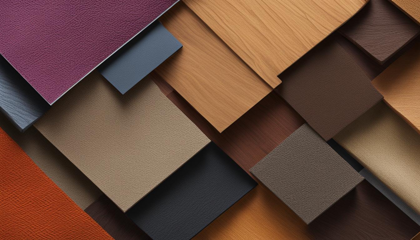
As we dive deeper into tactile design, we’re uncovering new ways to enrich the user experience by implementing design elements that mimic the real world. By tactfully integrating material design textures into our web interfaces, we enable users to feel as though they can reach out and touch the very fabric of the site, even though it exists within the confines of a screen.
Implementing Tactile Sensations in UI
The essence of implementing tactile sensations is found in the attention to detail within our design elements that encourages engagement and sparks curiosity. These sensory touchpoints bolster the connection users have with our site, prompting a more intuitive and memorable journey through the digital landscape.
Integrating material reality into our design is not just about aesthetics; it’s a commitment to creating a user interface that feels tangible and responsive to the natural human interaction of touch.
- We enhance our interfaces with textures that users can almost feel, creating a multi-dimensional experience.
- Our design philosophy places substantial emphasis on the use of shadow, depth, and motion to simulate material surfaces.
- These tactile cues deftly woven into our UI foster an environment where users feel connected and grounded in the digital experience.
Our exploration into tactile design opens doors to a future where the digital space is not merely seen but felt. It’s a convergence of touch and technology that deepens the user’s engagement, grounding the digital experience in a reality that they can relate to and appreciate on a deeper level.
Advanced Scrolling Effects: Guiding the User Journey
In the evolving landscape of Australian web design, we recognise the power of engaging our audience through dynamic scrolling animations. As we traverse 2023, our approach effectively employs scroll-triggered effects to maintain user engagement and impart a storytelling charm to the digital journey.
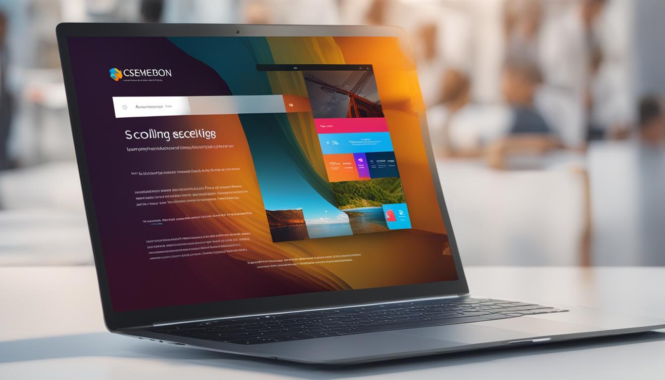
These scrolling techniques are far from mere embellishments; they’re integral to creating user engagement layers that captivate and intrigue. With each scroll, we invite our users to a choreographed experience, where content reveals itself progressively, ensuring a memorable interaction with our brand’s narrative.
Let us walk you through how these advanced effects can architect a user journey:
- Upon landing, users are greeted with subtle motions that set the narrative tempo.
- As they scroll, interactive elements unfold, encouraging deeper exploration.
- Storytelling elements dynamically evolve, fostering a sense of discovery.
Consider the impact of thoughtfully orchestrated scrolling on user experience:
| Before Scrolling Effects | After Scrolling Effects |
|---|---|
| Static content delivery | Dynamic content narrative |
| User as observer | User as participant |
| One-dimensional user journey | Layered interactive expedition |
| Predictable page flow | Unexpected content revelations |
Our forward-thinking embrace of advanced scrolling effects represents a fusion of technology and creativity, where the visual language speaks volumes. We’re dedicated to enhancing every pixel of our Australian web presence with scroll-triggered animations that not just tell a story but invite users to become a part of it.
It’s not just about moving through a page; it’s about creating a journey that compels users to return to our digital abode, time and again.
As industry innovators, we continually explore the depths of interactive design. Our commitment to dynamic scrolling animations and advanced storytelling mechanisms positions us as pioneers, leading the charge in captivating digital experiences that resonate with Australian audiences.
Full-Screen Video Headers: The Impact of Motion Graphics
Today’s forefront in web design is rapidly carving out space for dynamic, engaging video content, where full-screen video headers become more than a mere passing trend. They are the embodiment of cutting-edge motion graphic design, setting the stage for a profoundly immersive website header experience. This innovative approach fundamentally shifts how users are introduced to your website, ensuring the first point of contact is as captivating as it is informative.
Designing Effective Video Headers for Maximum Engagement
Creating an impactful full-screen video header is an art form that involves more than just attractive visuals. It’s about constructing a narrative that aligns with your brand’s story, engaging users from the moment they interact with your platform. Motion graphic design marries the visual aesthetics with the brand ethos to produce a symphony of sound, movement, and engagement. Below, we chart the principles guiding our endeavours to craft immersive website headers.
When envisaging your video header, consider these core elements:
- High-quality visuals that reflect your brand’s message and values.
- Seamless integration into the site’s overall design for a cohesive user experience.
- Strategic use of motion to direct the user’s attention and encourage further exploration.
Our commitment to harnessing the power of video content is unwavering, as we recognise the potential to not only tell a story but to invite our audience into our narrative, making them an active participant from the outset.
As we integrate these principles into our digital strategy, we ensure every decision is made with user engagement as the prime focus. We move beyond static visuals and into an era of dynamic presentation, showcasing our ability to evolve and adapt in an ever-changing digital landscape.
We’re proud to lead among Australian web designers, pioneering a future where each visit to a website is an entrance into a world defined by engaging video content and elegant motion graphic design. Through meticulously designed full-screen headers, we offer an immersive gateway into the essence of our brand.
Explore the artistry behind crafting video headers that not only capture the eye but the imagination:
| Feature | Benefit |
|---|---|
| High-definition visuals | Sharp, stirring imagery that conveys professionalism and attention to detail. |
| Intuitive motion | Guides the user’s journey, enhancing engagement and retention. |
| Brand-aligned storytelling | Creates a lasting impression, forging a deep connection with the viewer. |
| Responsive design | Ensures accessibility and consistent experience across various devices and platforms. |
By adhering to these guidelines, we present an authentic and powerful depiction of our brand’s story, engaging our audience from the first glance. As we look to the future, our resolve is clear: to craft immersive website headers that resonate, inspire, and transform the user’s digital encounter with our brand.
Asymmetrical Layouts: Breaking Free from the Grid
In a bold move that signifies a departure from the conventional, our embrace of asymmetrical layouts represents a paradigm shift in creative web composition. This design tactic cleverly defies the traditional grid system, inviting users into a space where structure meets creativity, and expectations are challenged through innovative visual constructs.
The adoption of these unconventional layouts is a deliberate strategy aimed at capturing the imagination of our audience, whirling them into an avant-garde exploration of our content. These layouts are not random acts of defiance; they are calculated gestures aimed at fostering engagement through design innovation, provoking thought and intrigue at every turn.
Asymmetry in web design is no longer fringe—it’s at the forefront of web aesthetics, demonstrating our passion and commitment to pushing the boundaries of standard design conventions.
We have identified several key ways in which asymmetrical layouts contribute to a more engaging user experience:
- Their dynamic design imbues our web pages with motion and life, breaking free from static traditions.
- They lend themselves to powerful storytelling, with elements positioned deliberately to draw the eye along a strategic path.
- The unconventional balance radiates energy and emphasises critical content, making for a compelling and memorable user journey.
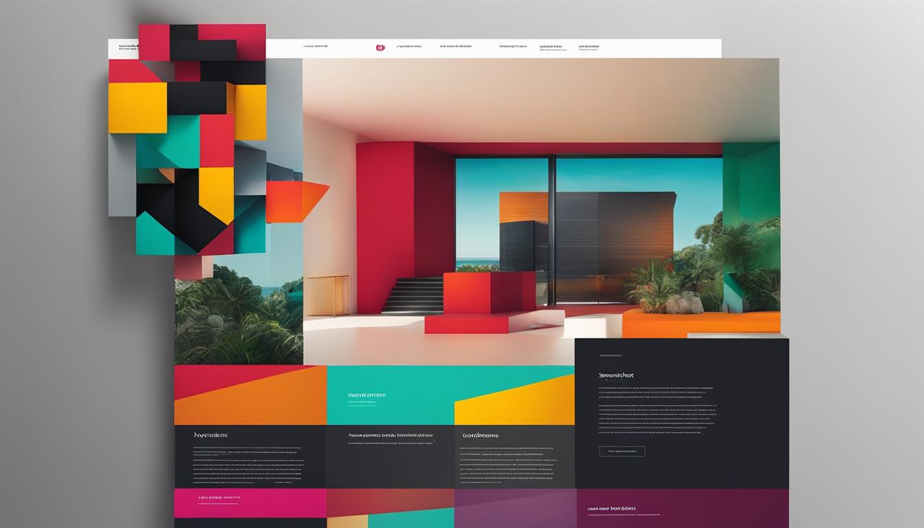
When considering the practicalities of implementing asymmetrical designs, we focus on how each element interacts with the others, ensuring that the lack of balance is perceived as intriguing rather than jarring. To illustrate the intricacies of our design process, consider the following comparative insights:
| Traditional Grid Layout | Asymmetrical Design |
|---|---|
| Uniform, column-based structure | Off-balance yet harmonious arrangement |
| Predictable rhythm and flow | Innovative, engaging sequences |
| Restrained creative expression | Limitless creative potential |
| Safe and familiar user experience | Exciting and novel interactive encounters |
As we continue to redefine the norms of Australia’s digital scene, we are eager to share these forays into the unconventional. It is our commitment to pioneering design that inspires us to continually explore the boundless potential of creative web composition. The asymmetrical layouts are not just designs; they are our latest endeavours to create, connect, and captivate.
Voice-Activated Interfaces: The Rise of Sound in Design
In today’s transformative digital sphere, we’re witnessing a seismic shift towards voice user interfaces that herald a new era of user interaction—a paradigm where the auditory design experience synchronises with intuitive visuals. This move towards interactive web technology is not just a leap forward; it embodies the zenith of inclusive design.
With sound becoming a cornerstone within the digital realm, the harmonic blend of voice activation and user interface design is crafting enriched navigational experiences, redefining engagement on our websites. It is through these immersive, sonorous interactions that we are breaking new ground in creating universally accessible environments.

Our journey to integrate voice activation is not merely about embracing trends—it’s a commitment to crafting experiences that accommodate a dynamic range of user needs and preferences. Herein lies the foresight to adopt a holistic approach, where every digital touchpoint echoes our dedication to user-centred design styled to inclusivity and engagement.
The synergy between voice commands and traditional navigation has cultivated an auditory design experience that extends beyond the visual domain, offering users a sense of command and fluidity in how they interact with our online spaces.
Pioneering into voice-activated interfaces is our clarion call to explore the potent intersection of sound, design, and technology, culminating in a more natural and potent user experience.
- We’re cultivating experiences that resonate across the senses, ensuring our digital interfaces are as audible as they are clickable.
- Our focus on encapsulating voice recognition within web design is shifting the interactive paradigm to auditory realms.
- The blending of interactive web technology with voice commands stands as testament to our innovation and foresight.
As we pioneer into the future, our vision is crystal clear—building digital spaces that are not just seen and felt, but also heard. This bold venture into voice-activated interfaces is more than just technology; it’s an invitation into an engaging, accessible, and holistic web experience that resonates with every user.
Colour Trends: Embracing the New Palette of the Web
The progressive landscape of web design in Australia is constantly ebbing and flowing with the nuances of colour trends that define our times. This year, we’ve noticed a significant shift towards the integration of trendy web palettes that are not merely about aesthetics but deeply rooted in colour psychology’s impact. With the introduction of PANTONE’s colour of the year, Viva, we are reminded once again of the potent influence colour choices have on the user’s psychological experience on the web.
As digital artisans, we eagerly adopt these fluid hues, fully aware of the subconscious narratives these colours weave into our web designs. Tapping into this vibrant spectrum, our web spaces become more than visual interactions; they morph into realms of emotive connectivity, resonating with the sensibilities of our audience.
Influence of Colour Psychology on Web Design
It is a well-known fact that colours have the ability to alter perceptions and evoke emotional responses. Our choice of colours in web design is a deliberate strategy aimed at enhancing user engagement and crafting a compelling brand story. By understanding the psychological undertones behind each hue, we deftly sculpt user experiences that align with the intended emotional mood, invoking reactions that resonate on a deeper level.
| Colour | Emotional Impact | Use in Web Design |
|---|---|---|
| Viva | Vibrancy and Vivacity | Call to Action, Promotional Areas |
| Cool Blues | Trust and Dependability | Professional Services, Informational Sections |
| Warm Reds | Excitement and Urgency | Limited Offers, Alerts |
| Earthy Greens | Growth and Harmony | Eco-Friendly Brands, ‘About Us’ Pages |
| Soft Pastels | Calmness and Clarity | Healthcare, Wellness Sections |
We seamlessly integrate these colours into the fabric of our web design aesthetics, creating environments that do more than catch the eye; they speak to the heart. Thus, by synchronising trendy web palettes with the principles of colour psychology, we deliver user-centric experiences that not only navigate the current pulse of design but also build a timeless emotional bridge with our visitors.
Embracing these colour trends, we reinforce our commitment to delivering nuanced, psychology-driven web experiences. Our web domains are living canvases where colour paints the story of our brand, elegantly and effectively weaving the ethos of our Australian ethos into the global digital narrative.
Split-Screen Aesthetic: Mastering the Art of Dual Elements
The split-screen web design trend is transforming the way we present information on our Australian platforms, by neatly dividing the screen to offer a balanced visual layout. Through the practice of a symmetrical design, split-screen layouts effectively showcase dual-content presentation, serving as a sophisticated method to juxtapose contrasting content such as services or products. This design strategy not only promotes an organised visual dichotomy but also fosters user interaction and deliberation, resulting in more meaningful user engagements.
Incorporating a split-screen aesthetic communicates our adaptability as well as our forward-thinking approach to digital solutions. From a branding perspective, the layout allows us to present two separate, yet equally important pieces of content without compromising on design or functionality—reinforcing our image as an innovator in the web industry.
Here are some of the benefits of employing this aesthetically engaging approach:
- Clarity in Choice: Users are presented with clear choices, enabling them to navigate through our site with greater confidence.
- Enhanced User Engagement: By dividing the screen, users can interact with multiple sections simultaneously, leading to increased interaction rates.
- Neat and Organised: Our split-screen design offers a clean and organised user interface, streamlining the user’s journey on our site.
Let’s delve into a comparison of balanced visual layout versus traditional design approaches:
| Traditional Design | Split-Screen Design |
|---|---|
| Single focal point | Dual focal points |
| Sequential content presentation | Simultaneous content presentation |
| Possible content hierarchy | Parity in content importance |
| Scrolling navigational model | Interactive, click-based model |
We remain attuned to the advancements in web design technology and customer preferences. As such, exploring and mastering the split-screen aesthetic is an integral part of our mission to deliver top-tier web solutions. We’re always looking for ways to marry functionality with exemplary design—and split-screen layouts offer us the perfect canvas to achieve this.
The transformative effect of this approach on user experience and brand perception underscores our dedication to producing highly functional and visually appealing digital environments. In 2023, we anticipate the split-screen aesthetic to become even more prevalent in web design, and we are well-prepared to lead this trend within the Australian market.
Mobile-First Design: Prioritising the Smartphone Experience
Within the brisk tempo of Australia’s digital environment, we observe the ascendancy of mobile usage in web browsing—not as a fleeting trend, but as a necessitous shift in design philosophy. We recognise that the contemporary web sphere demands a smartphone-first strategy, one that firmly places responsive mobile design at the forefront, catering adeptly to over half of internet traffic originating from mobile devices. As this sector burgeons, our focus sharpens, honing interfaces that epitomise mobile web usability and exemplify user-centric innovation.
Adapting to the perpetual motion of our users’ lifestyle means understanding and intuitively responding to the nuances of mobile navigation. Our commitment to a mobile-first design ensures every tap, swipe, and pinch is considered, crafting intuitive mobile experiences that are not just a convenience but a necessity in a world that favours the palm-held screen. This design imperative speaks to the essence of accessibility, enabling our audience to interact with our digital offerings on-the-go, with gratifying fluidity and ease.
Statistics Behind Mobile Usage in Web Browsing
Australian mobile web users are a fast-growing constituency, piloting the way we sculpt the digital experience. Stats reveal a robust climb in smartphone dependence—reflective of a societal pivot that sees mobile devices as not just communication tools, but gateways to the world wide web. With over 50% of online traffic now accredited to mobile, our blueprint for web development is clear: prioritising the mobile dimension to yield an unmatched user experience, directly aligned with current demands and future projections.
It’s this foresight that impels us to perfect responsive mobile design, with a vigilant eye on ensuring every digital interface we unveil is optimised for the breadth of mobile devices populating the market. Through our smartphone-first strategy, we stand at the vanguard, equipping our web domains with the resilience to adapt, the agility to respond, and the innovation to lead in Australia’s thriving digital expanse.
FAQ
What defines cutting-edge web design trends in 2023?
Cutting-edge web design trends in 2023 encompass a variety of creative and technological advancements such as experimental navigation, kinetic typography, brutalist layouts, layered experiences, custom illustrations, Lottie animations, interactive 3D elements, tactile textures, dynamic scrolling effects, full-screen video headers, asymmetrical compositions, voice-activated interfaces, evolving colour trends, split-screen layouts, and a mobile-first approach tailored to enhance online business success and cyberspace differentiation.
How does experimental navigation contribute to user engagement and brand uniqueness?
Experimental navigation breaks away from traditional menu structures, offering innovative navigation patterns that intrigue and guide users in an interactive way. This type of navigation is not just about aesthetics but also function, directing users through the website content in engaging ways that can’t be found on other platforms, thereby reinforcing brand uniqueness and enhancing overall user engagement.
Why is kinetic typography becoming a pivotal feature in dynamic web content?
Kinetic typography brings text to life through movement and animation, grabbing website visitors’ attention immediately and engaging them visually. It serves as a narrative tool that can unveil content progressively and emphasize key messages, making it a critical element for dynamic web content and visual engagement.
How does brutalist web design impact user experience foundations?
Brutalist web design impacts user experience foundations by challenging the status quo and offering raw and bold visual alternatives. Its unconventional web aesthetics and stark web layouts encourage simplicity and functionality, which can be refreshing and engaging for users tired of overly polished and formulaic web designs.
What role does layering play in brand storytelling on websites?
Layering in web design creates visual depth and textured web interfaces, which allows for more complex and compelling brand storytelling. It layers images, colours, animations, and other elements to convey a narrative that resonates with the brand’s message and connects with the audience on a deeper level.
How do custom illustrations enhance digital brand identity?
Custom illustrations offer a unique and engaging way to present a brand’s identity online. Bespoke web visuals are crafted to reflect the brand’s personality, allowing for a more personal connection with the audience and helping the brand stand out in a crowded digital space with its tailored branding illustration.
Why are Lottie animation files important for web design?
Lottie animation files are lightweight yet powerful tools for adding interactive animations to a website. They improve site performance while delivering sophisticated and enhanced user interactions, making web experiences both aesthetically pleasing and engaging.
What are the benefits of using 3D design in websites?
Utilising 3D design in websites offers an immersive online experience that can intrigue and engage users beyond flat, two-dimensional interfaces. Three-dimensional web elements maximise user engagement by providing a dynamic way to explore content, interact with products, and immerse themselves in the brand story.
In what ways does tactile design improve user interfaces?
Tactile design introduces textures and material-like qualities to digital interfaces, enhancing the sensory experience and making the UI more intuitive and tangible. This sensory design approach can make digital interactions feel more realistic and comforting, thereby improving the overall user experience.
How do advanced scrolling effects enhance storytelling on the web?
Advanced scrolling effects provide a dynamic method to reveal content and animations as the user scrolls, which can captivate and maintain their interest. This technique turns scrolling actions into a storytelling device, offering a creative narrative flow that keeps users engaged with the content.
What makes full-screen video headers effective in web design?
Full-screen video headers are effective because they create an instant visual impact, delivering engaging content and setting a compelling tone for the user’s visit. This incorporation of engaging video content and motion graphic design in immersive website headers can captivate attention quickly and leave a lasting impression.
Why are asymmetrical layouts important in contemporary web design?
Asymmetrical layouts introduce an element of surprise and creativity in web design, breaking free from the traditional grid system. This creative web composition uses unconventional layouts to challenge conventional design norms, creating a unique and dynamic visual experience for users and promoting design innovation.
How are voice-activated interfaces changing web interactions?
Voice-activated interfaces are changing web interactions by incorporating sound and voice commands into the design. This advancement represents a shift towards more natural and accessible user experiences, fostering an interactive web technology that can respond to auditory input and make websites more inclusive.
Why is understanding colour psychology significant for web design?
Colour psychology is significant for web design because the choice of palette can profoundly affect users’ emotions and behaviors. Understanding trendy web palettes and the colour psychology impact allows designers to influence how a brand is perceived and can enhance the overall aesthetics and effectiveness of the design.
What are the advantages of a split-screen web design?
A split-screen web design facilitates a balanced visual layout that can neatly present dual elements without causing information overload. This design can effectively display contrasting content side-by-side, enabling users to interact with each segment independently, making it ideal for showcasing a variety of products or services.
How does mobile-first design cater to current web browsing trends?
With over 50% of internet traffic coming from mobile devices, mobile-first design ensures that websites are optimised for on-the-go usage, focusing on responsive mobile design and smartphone-friendly interfaces. This approach improves mobile web usability and provides a better browsing experience for the majority of users who access the web via their mobile devices.

